
Last week when visiting Hurwin Anderson’s exhibition in the Tate Britain, I noticed a number of practices, copies and reiterations of the same image. Anderson, working from his own photographs and collages, created images through deconstruction and recreation that necessitates multiple attempts at resculpting and rebuilding. Through showing multiple examples of a work, the curation of the exhibition forces a crack within the idea of the artistic virtuoso but glazes over the model with the finish of a frame and a caption. This exhibition is not the first to place different stages of the same image amongst each other. But what does this certain choice reflect about the interest and desires of the viewers? Why place an unfinished version of a work beside its completed counterpart?
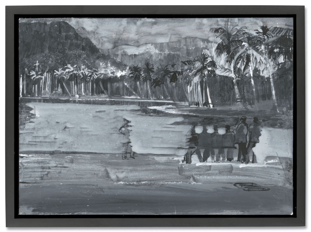
Personally, I believe this choice has been made because the curators know that in shows devoted to a particular artist, the viewer is interested in the celebrity one can make around the character and how that bleeds into the work. This was shown in the Picasso exhibition at the Tate Britain earlier this year, where when I visited many viewers sat on the steps to watch the entirety of the video displaying Picasso’s practice; whether out of tiredness or intrigue, the majority of participants were watching it repeatedly. When we appoint celebrities to certain individuals their presence, both still and moving, becomes addictive. We want to consume as much of ‘Picasso’ as possible because the art world has declared him God. To watch the process derealises the work and realises the artists, as viewers we can recognise the same ambition, tenacity, and excitement towards a project in ourselves when we see the different versions of Anderson’s pieces, similarly to how we witness the process of Picasso’s sketches and illustrative prints.


Prints and illustrations hold a different power, they have the illustrious image of a quick sketch or anatomical practice yet possess the class and regality of something far more linear and precise. They are somewhat seductive, reducing the image to its skin and bone and allowing for the flaws and ambitions to be vulnerable and present. In September 2025, Sotheby’s sold the collection of Picasso’s illustrations for Ovid’s Metamorphoses; scenes of Eurydice being bitten by a snake and Polyxema slaughtered on the Tomb of Achilles synthesise the horrors of death and the aesthetic of sex, through voluptuous bodies that dance across the print. Picasso still decompartmentalises the body’s natural frame, but in these compositions the flesh interconnects, limbs create waves that are detailed only by light pencil marks – Yet the emotions are raw and vulgar, almost mirroring the black and red-figured pottery which would often replicate similar stories.
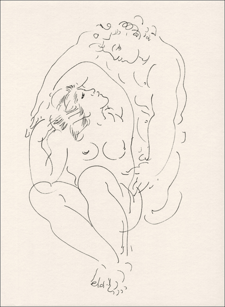
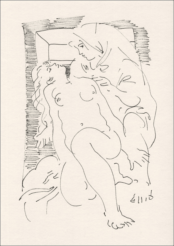
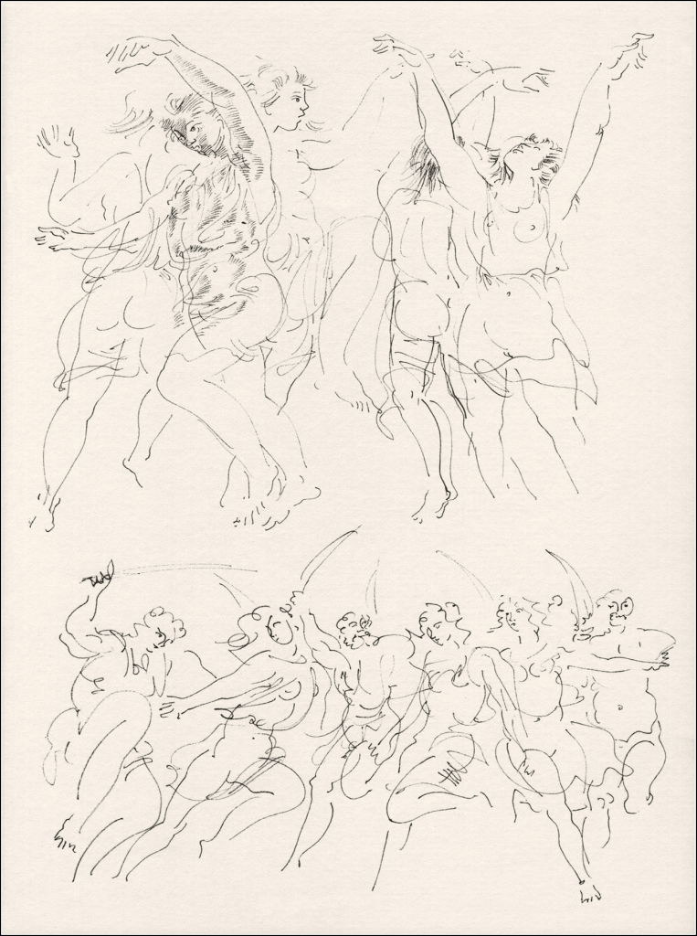
Illustrations by Hans Erni from The Song of Songs, 1973
Picasso’s illustrations brought me immediately to the work of Swedish illustrator and designer Hans Erni, specifically to his illustrations in the book The Song of Songs. They appear on the page like doodles sneakily scribbled onto the margins of the play, on some pages there’s no text at all, only the marks of bodies dancing in unison, animated through loose sketchwork. Their movement is again seductive, not only in the nudity of the figures but in the recklessness of the page, lines above lines, images intersecting upon each other, a negligence of space and time for the sake of hedonism. Yet on some pages you find two dancers completely alone, no script, no other drawing, just space that surrounds them, the page becomes silent. The compositions then become as vocal as the lyrics on the page. The Song of Songs being erotic poetry from the Hebrew Bible, utilises the derealisation of the subjects allowing for the same concealed seduction of the poems, which appeals to both authoritarian notion of sex and the human desire for intimacy. The sketches can never truly be pornographic, they are simply too elusive.
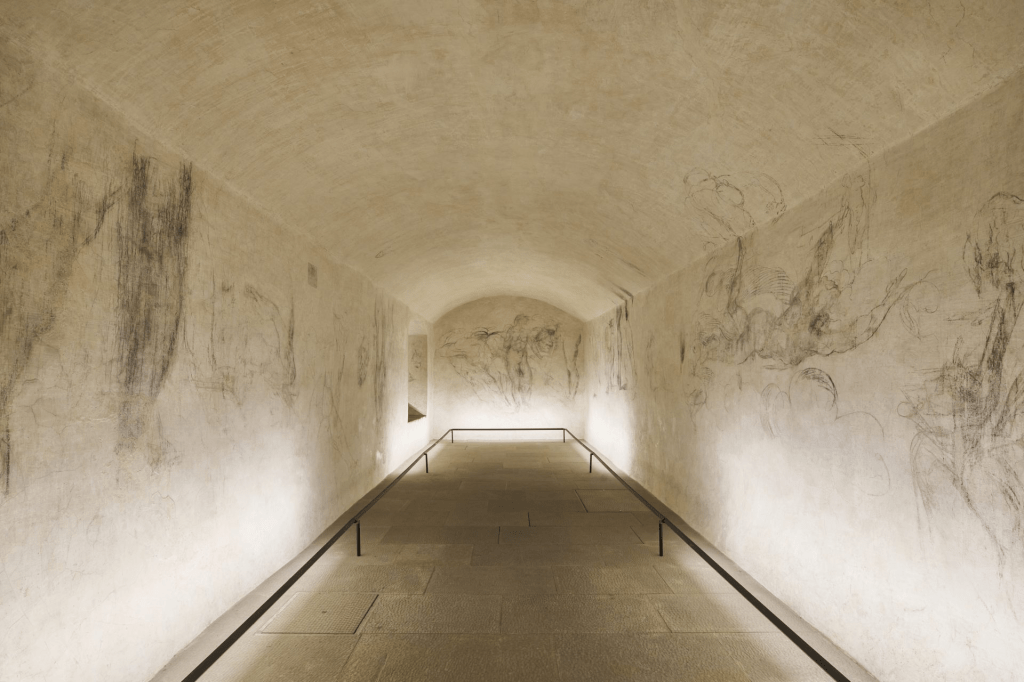
In February I visited Florence for the first time and there were only two exhibitions that I regretfully missed. Rothko in Florence at the Palazzo Strozzi, as it only opened in March of this year, and Michelangelo’s secret room in the Museum of the Medici Chapels, as it was out of my price range. Michelangelo’s secret room is similar in appearance to Picasso and Erni’s prints; it displays the unfinished works of Michelangelo created in hiding from the Medici family before escaping from Florence. There is a level of intimacy attained in these works which is not provided in the other Michelangelo masterpieces that populate the city, the preliminary sketches reveal Michelangelo at possibly his most vulnerable and afraid state, the reason for the entry price, €20, is not because of the fame of the work but the opportunity to insert yourself into Michelagnleo’s human experience. For the buyer of Picasso’s prints, which sold for £10,710, they are now able to experience something which is too intimate for the common man, it becomes an additional method of hierarchy and cultural capital.
Edited by Saffron Watkins and Milly Howes
Cover Image: Francesco Fantani, Image of Michelangelo’s secret room, 2023 from: https://www.theflorentine.net/2023/10/31/michelangelos-secret-room-medici-chapels-museum/



Leave a Reply